
Daniel Schwarz compares the best monospace fonts for developers that make coding a little easier on the eyes.

Daniel Schwarz compares the best monospace fonts for developers that make coding a little easier on the eyes.

The SVG path element offers a range of curve effects, and in this article, Craig Buckler demonstrates how to draw cubic bézier curves.

Mix DOM and vector interactions in SVG, translating from SVG to DOM coordinates and back, and translating to transformed SVG coordinates.

Craig explains how to add CSS styles to SVGs when used as static images, inlined backgrounds and HTML, sprites, HTML content effects and portable files.

Craig Buckler introduces SVG drawing basics, explaining the SVG viewbox, document structure, and how to draw shapes such as lines, circles, and rectangles.

Craig introduces CSS options for setting up a responsive website, including media queries, Flexbox and Grid, and covers tools for testing cross-browser compatibility.

Daniel Schwarz shows how to mark up forms using only HTML and CSS, covering new CSS3 options that make it easier to style inputs.

Learn why SVG is superior to pixel graphics in terms of scalability, responsiveness, interactivity, programmability, performance, and accessibility.

A thorough introduction to the use of CSS viewport units (vh, vw, vmin, and vmax) for truly responsive typography and layout elements.

Maria Antonietta Perna rounds up 30 top tools for front-end web developers, from code playgrounds and editors to CSS generators, JS libraries, and more.
Master modern CSS with these project suggestions, starting with the easiest and designed to build a breadth of skill in modern techniques.

Maria Antonietta Perna highlights the benefits of lazy loading images on websites and shows five approaches to implement lazy loading for your website.

Craig Buckler presents the various CSS methods available for hiding elements on a web page, looking at how they differ and which is best when.
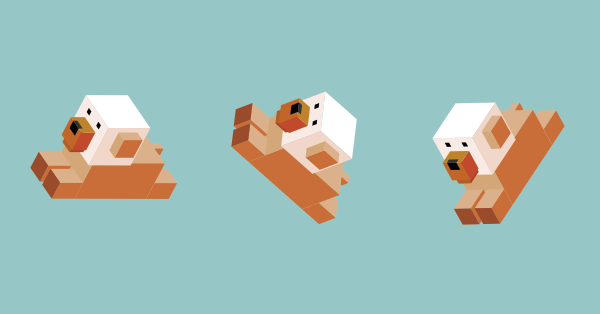
Craig Buckler demonstrates a neat trick for applying CSS3 transforms to background images. Rotating and skewing elements with stunning backgrounds will now be a breeze!

Craig Buckler reviews the art of creating printer-friendly web pages with CSS, showing how to retrofit them to any site, at minimal cost, without affecting or breaking existing functionality — delighting users and raising your site above competitor sites.

Adrian Sandu explains the purpose and advantages of rem units, demonstrating ways to use em and rem units in CSS layouts.

Learn how to use Tailwind, a highly customizable CSS framework that offers more flexibility and freedom than frameworks like Bootstrap and Foundation.

Akshay Kadam introduces Styled Components, a JS-based means of adding styles to your React project, and then shows how to use them in practice by imitating the Unsplash interface.

Want to design your CSS Grid layouts in a few clicks and grab the code? Here are five CSS Grid generators with great visual interfaces.
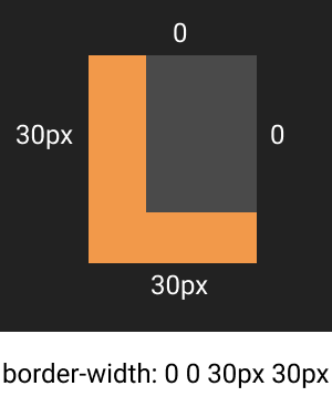
Our CSSBattle Code Challenge requires some 'outside the square' CSS thinking. Here are four tips to get you started on the right track.
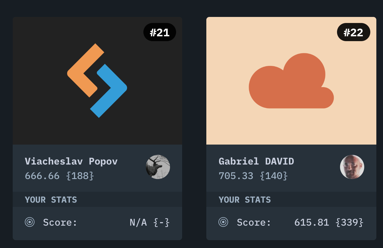
SitePoint's Code Challenge #2 is a battle of CSS wits. We're partnering with CSSBattles.dev and asking you to recreate the SitePoint Logo in HTML and CSS - oh and in the fewest possible characters too.
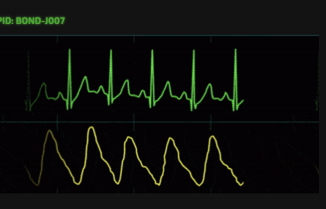
The user interfaces we see in popular culture are often more fun than ones we build at work. Here's a code challenge to show us how you'd build your own.

Pug is a preprocessor that speeds up writing HTML. Learn the syntax and features by building a simple Node project with Pug.

Learn how to migrate to Gulp.js 4.0 and update your 3.0 gulpfile.js configurations. Find out what you need to know about changes in Gulp.js functionality.

In this series on troubleshooting and optimizing your CSS, Tiffany Brown looks at ensuring code efficiency with the CSS Optimizer (or CSSO), a minification tool that runs on Node.js and which makes sure our file sizes are as small as they can be.

In this series on troubleshooting and optimizing your CSS, Tiffany Brown delves into the browser-based developer tools for Chrome, Safari, Firefox, and Microsoft Edge, covering the styles panel, cascade and inheritance problems, spotting invalid properties and values, and debugging responsive layouts.

In this series on troubleshooting and optimizing your CSS, Tiffany Brown introduces UnCSS and stylelint, two code-quality tools for analyzing the quality of your CSS.

Tiffany Brown introduces Flexbox, explaining the basic principles behind flex layout, with examples of laying out a basic media object, flexible form components, vertical centering, and creating grid-like layouts, as well as explaining when to use Flexbox over CSS Grid.
Tiffany Brown introduces the basics of CSS Grid, covering the grid formatting context, defining a grid layout, explicit versus implicit grids, specifying track size for an implicit grid, creating flexible grids with flex units, using the grid-template shorthand property, and repeating rows and columns.

Scroll snap lets developers define the distance an interface should travel during a scroll action. You might use it to build slide shows or paged interfaces―features that currently require JavaScript and expensive DOM operations.